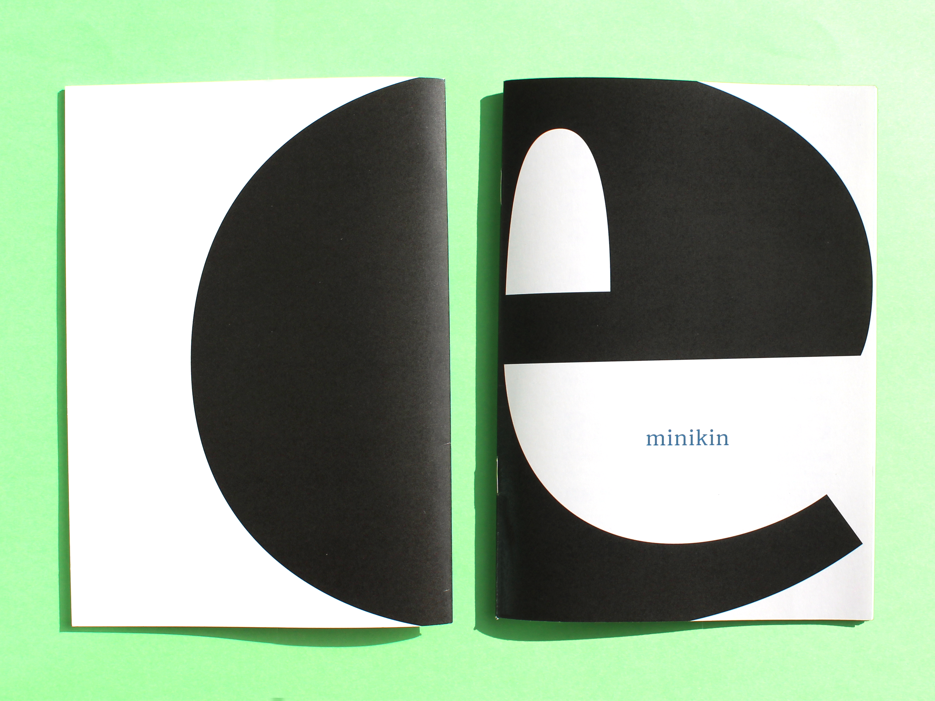
Minikin Font
This type family was developed as the final project of the Design undergraduate program at the University of Brasília, BR.
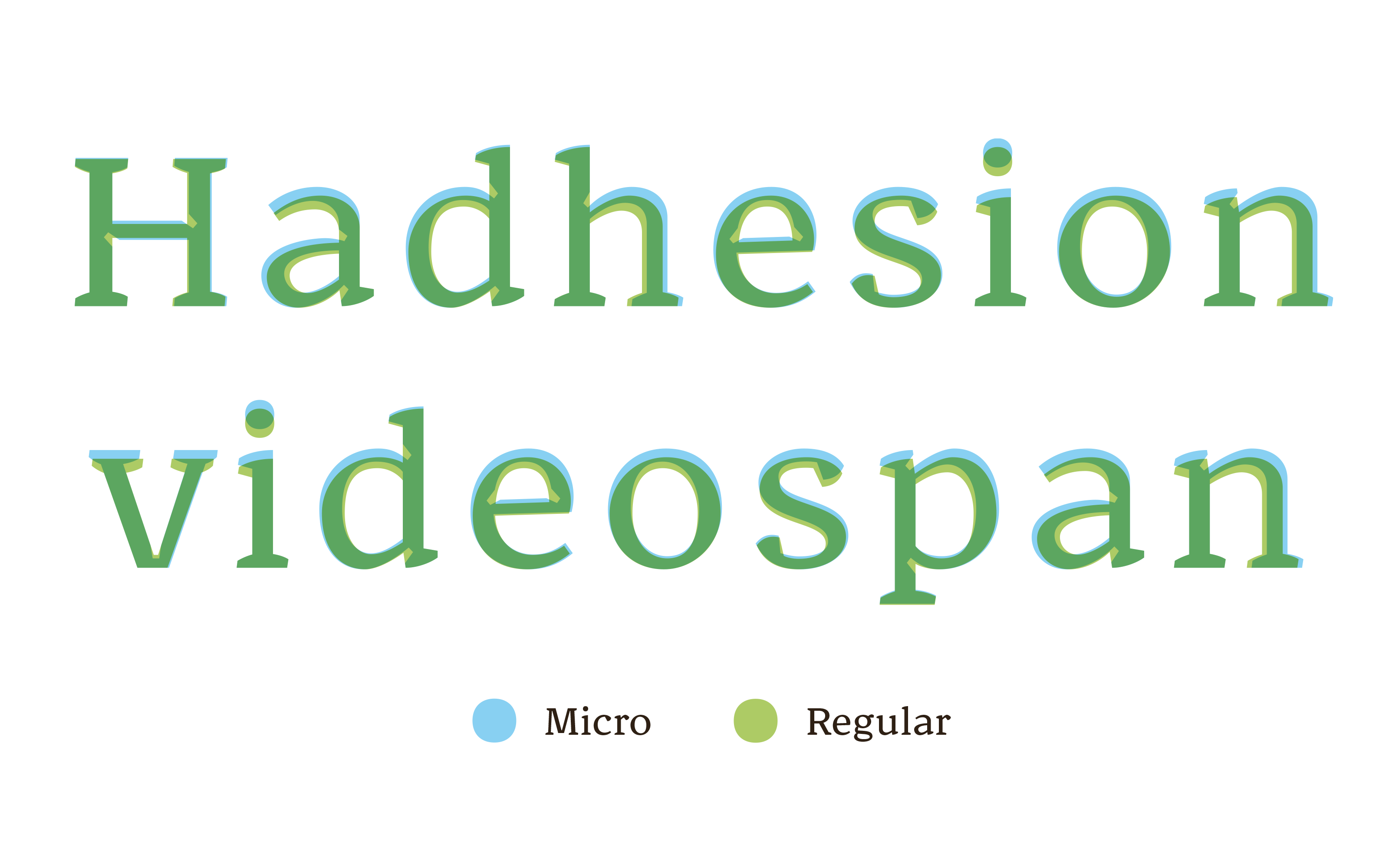
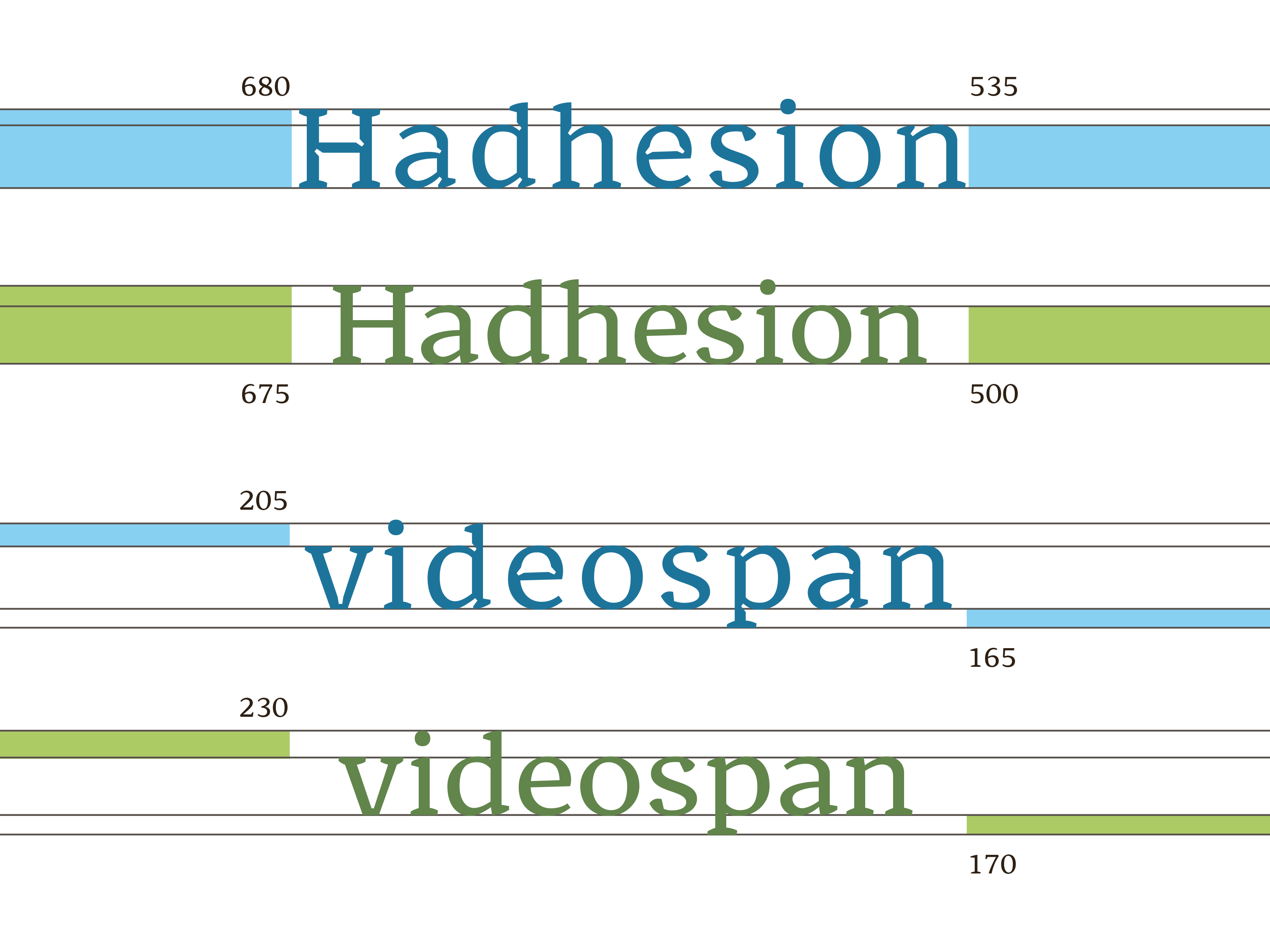
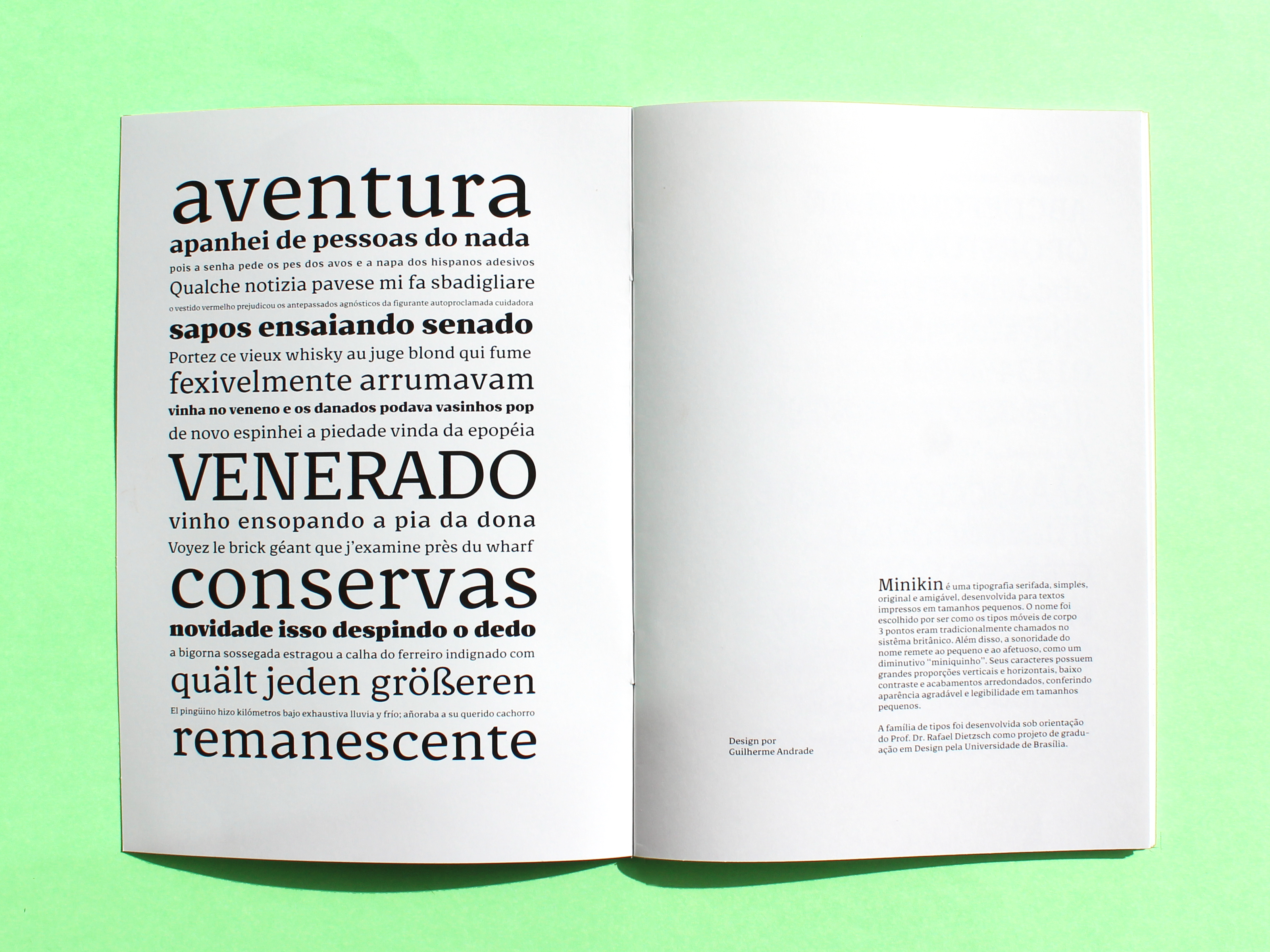
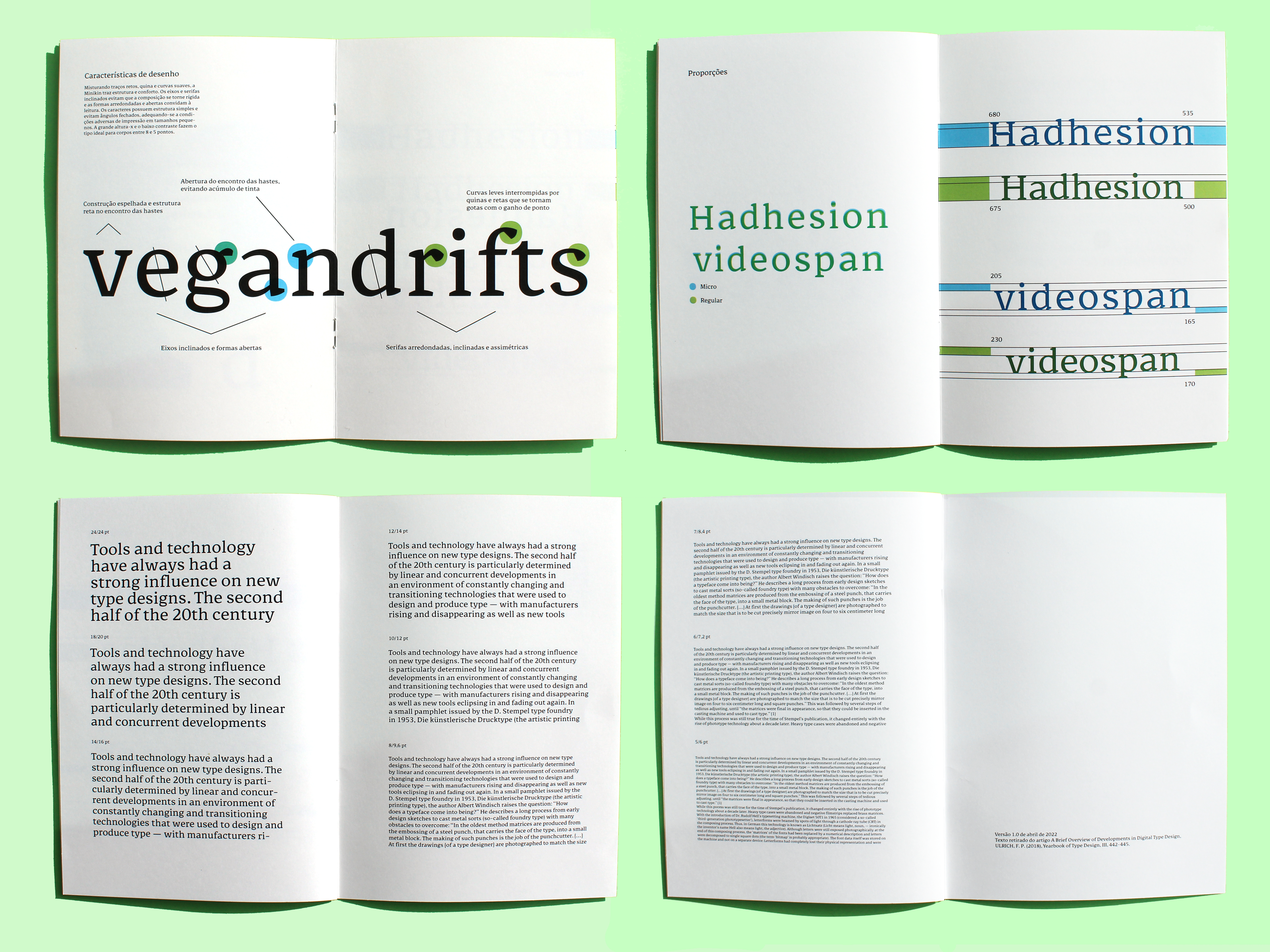
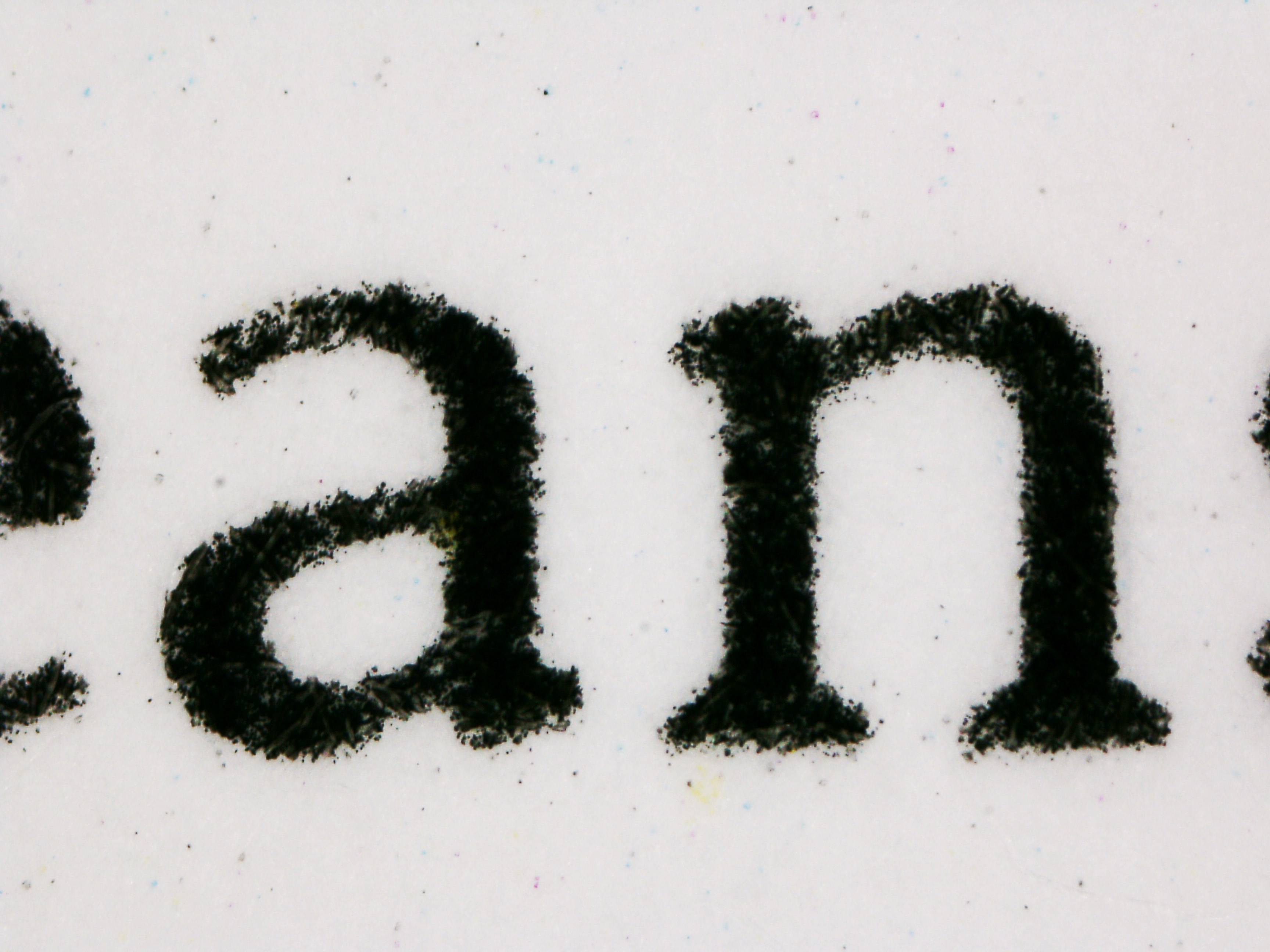
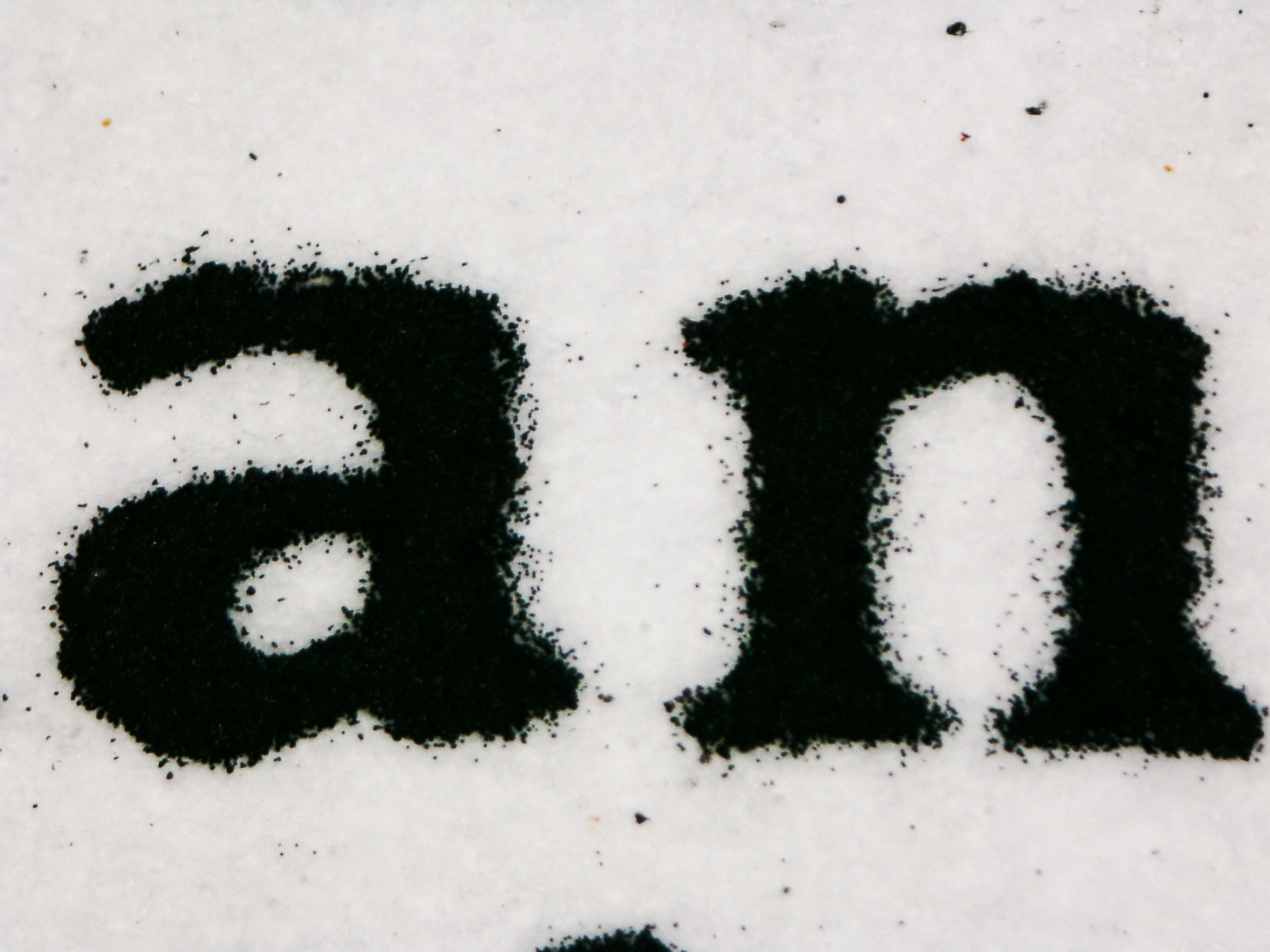
The name was chosen because it was how the 3-point size was traditionally called in the use of metal typefaces in the british systems. In addition, the sound of the name refers to the small and affectionate, as a diminutive “miniquinho” in portuguese. Its characters have large vertical and horizontal proportions, low contrast and rounded finishes, giving a pleasant appearance and legibility in small sizes.
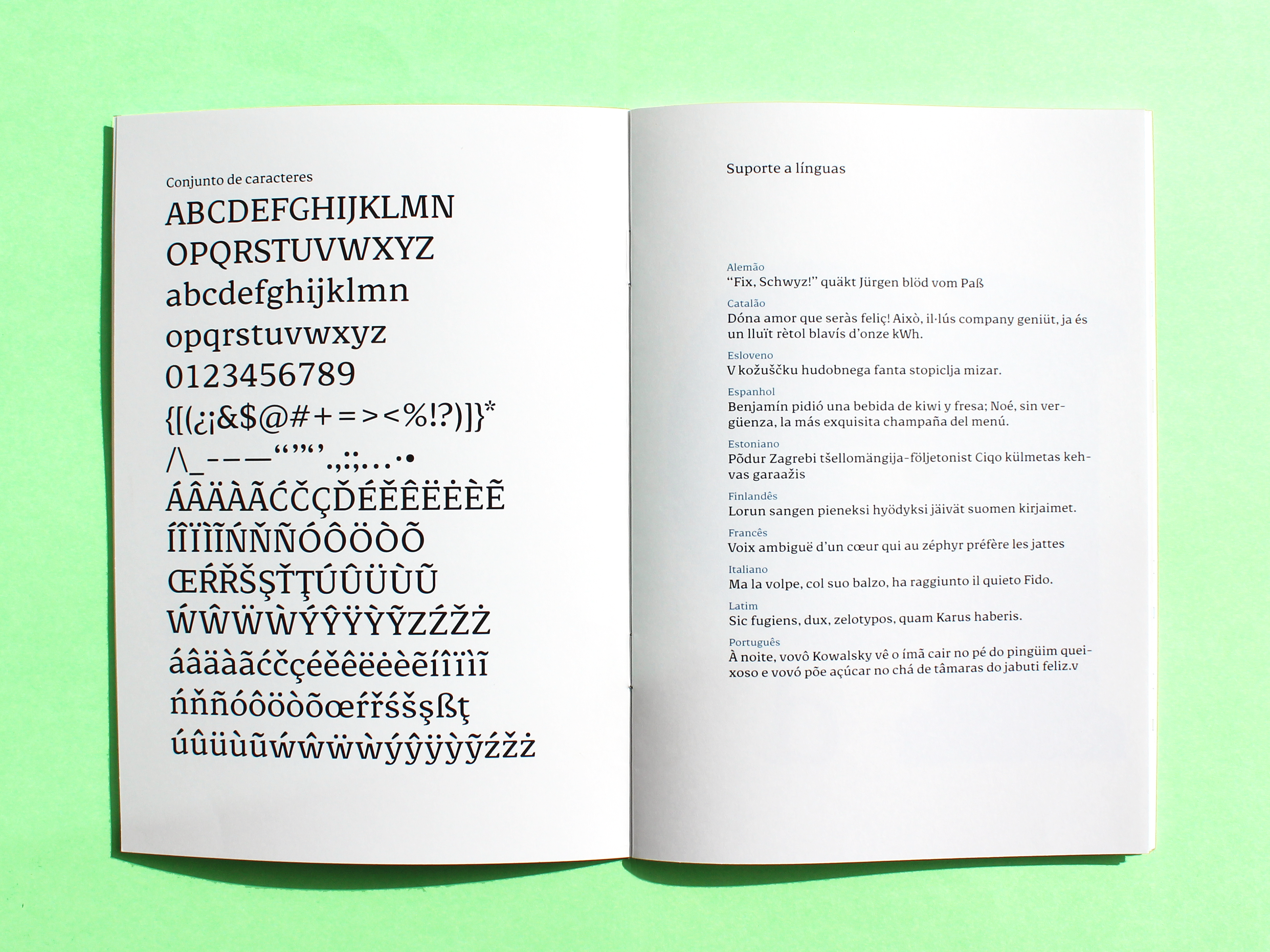
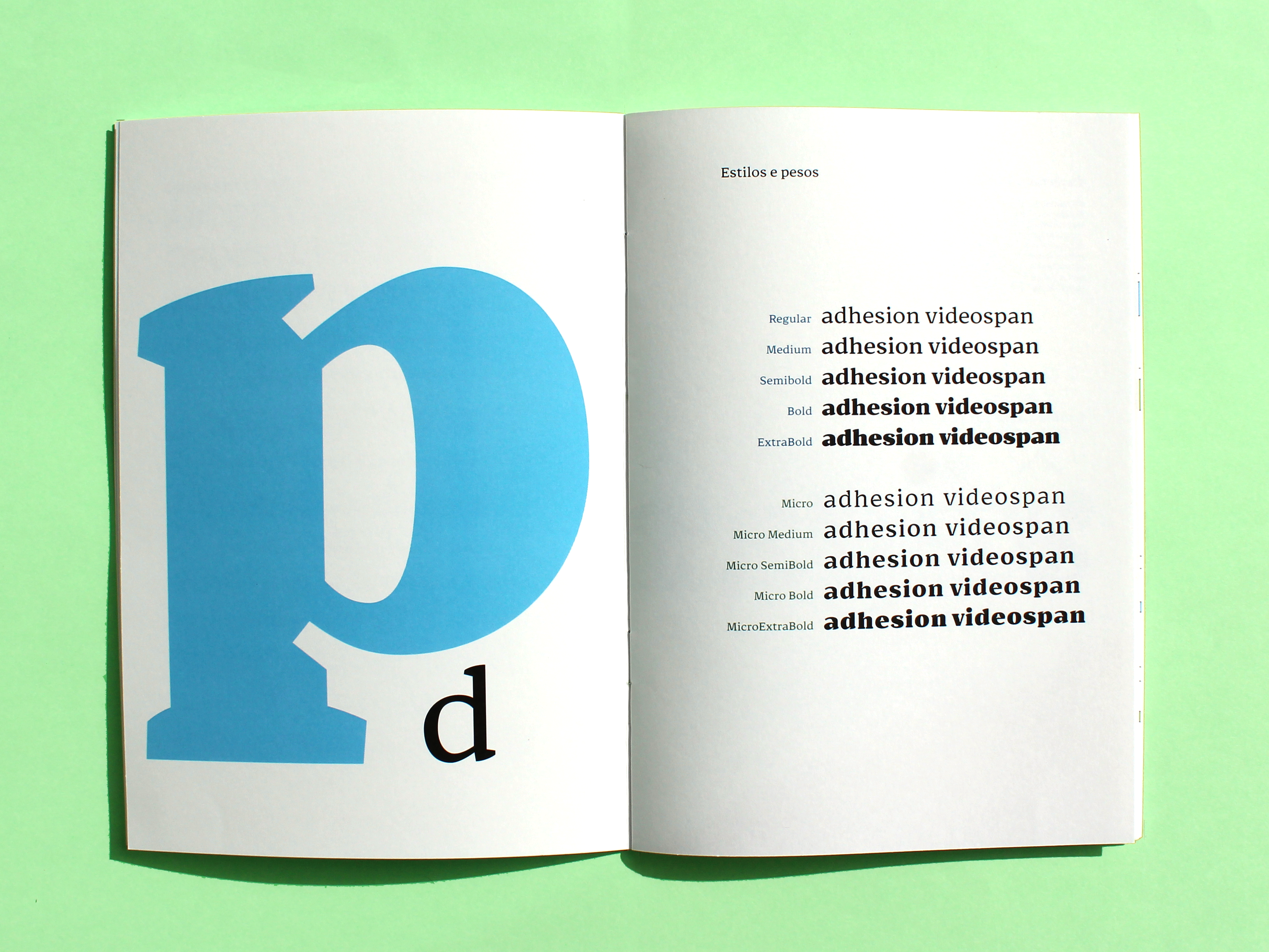
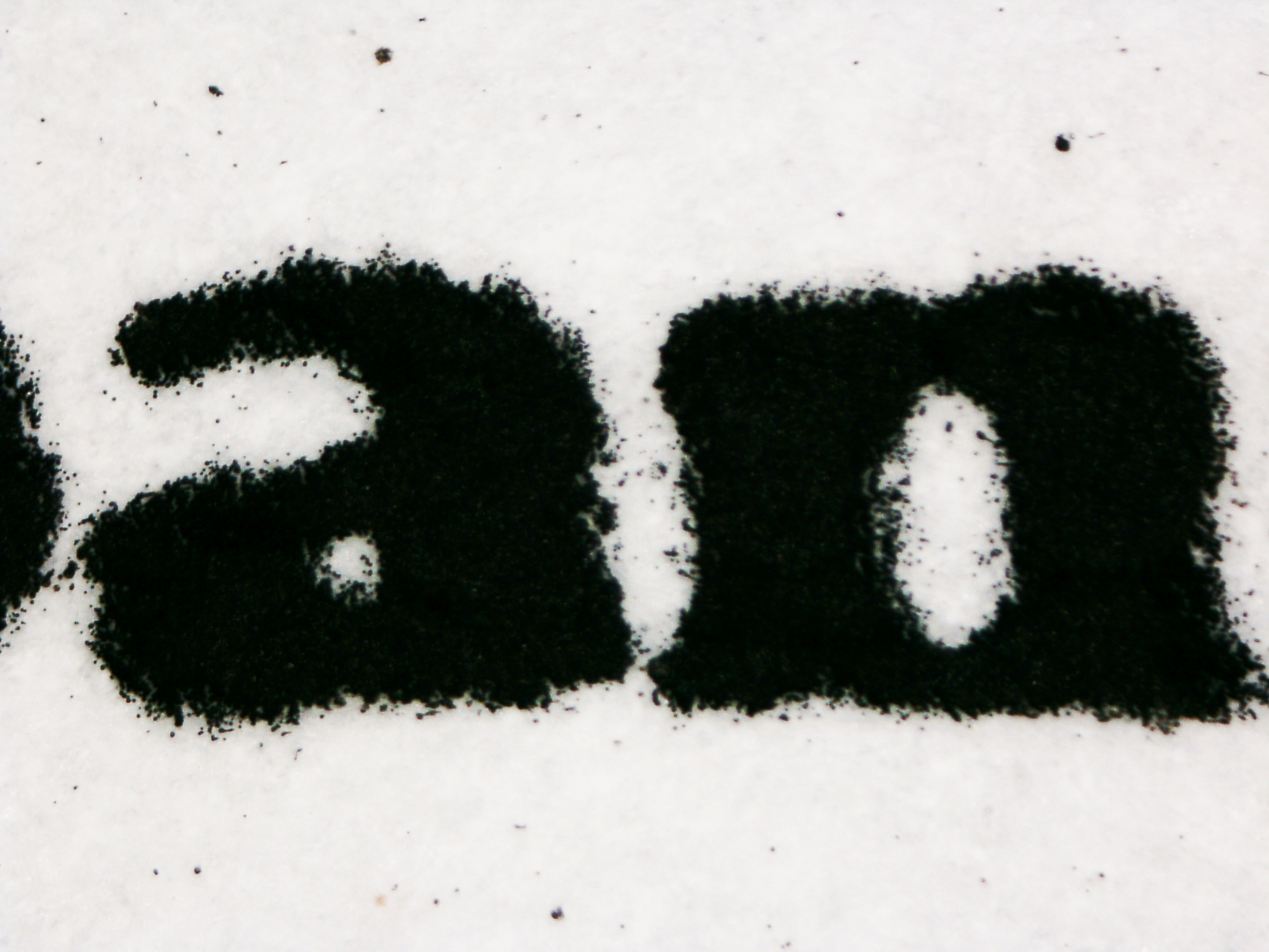
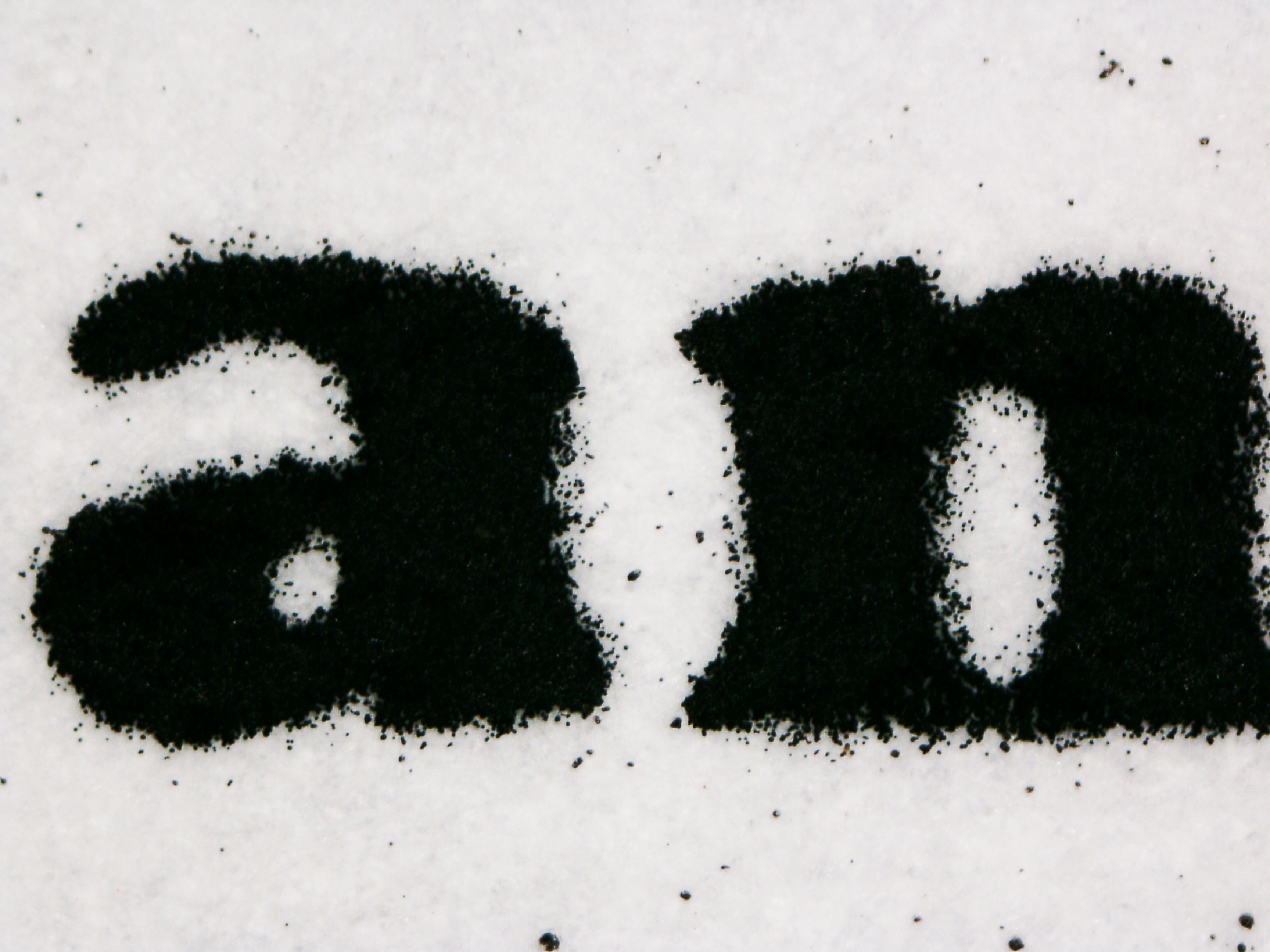
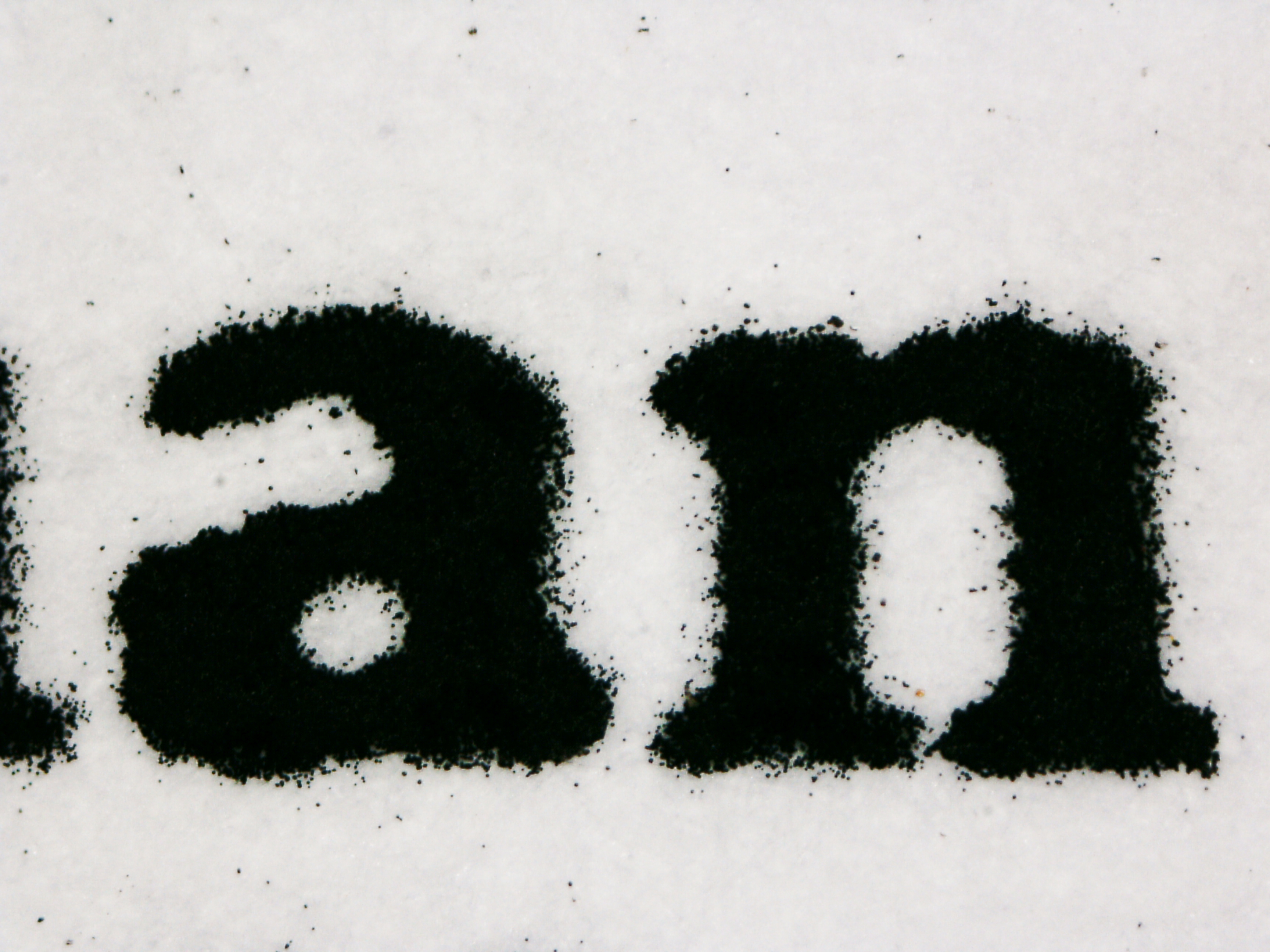
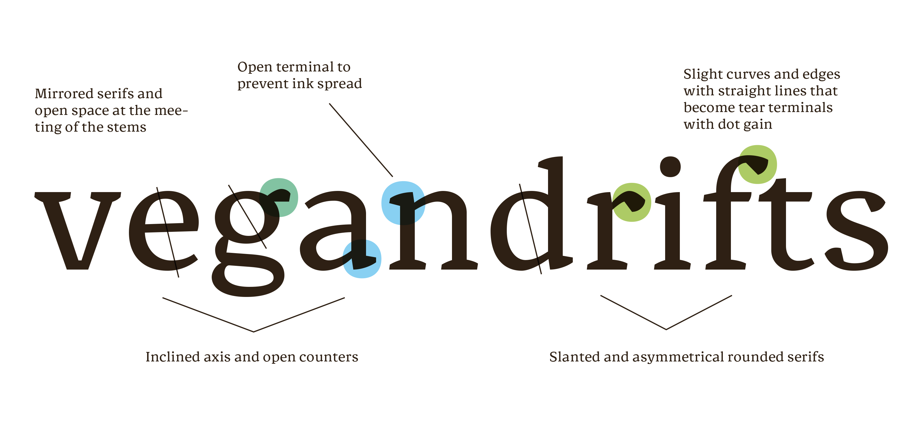
Mixing straight lines, corners and soft curves, Minikin brings structure and comfort. The slanted axes and serifs prevent the composition from becoming rigid and the round and open shapes invite reading. The characters have a simple structure and avoid tight angles, adapting to adverse printing conditions in small sizes. The large x-height and low contrast make it ideal for sizes between 8 and 5 points. The type family supports different languages such as German, Catalan, Slovenian, Spanish, Estonian, Finnish, French, Italian, English and Portuguese. At the moment the font has two variation axis, weight (Regular, Medium, Semibold, Bold and Extrabold) and optical size (Regular and Micro), but it is my intention to expand the optical axis with more extreme variations ant to make the font variable.
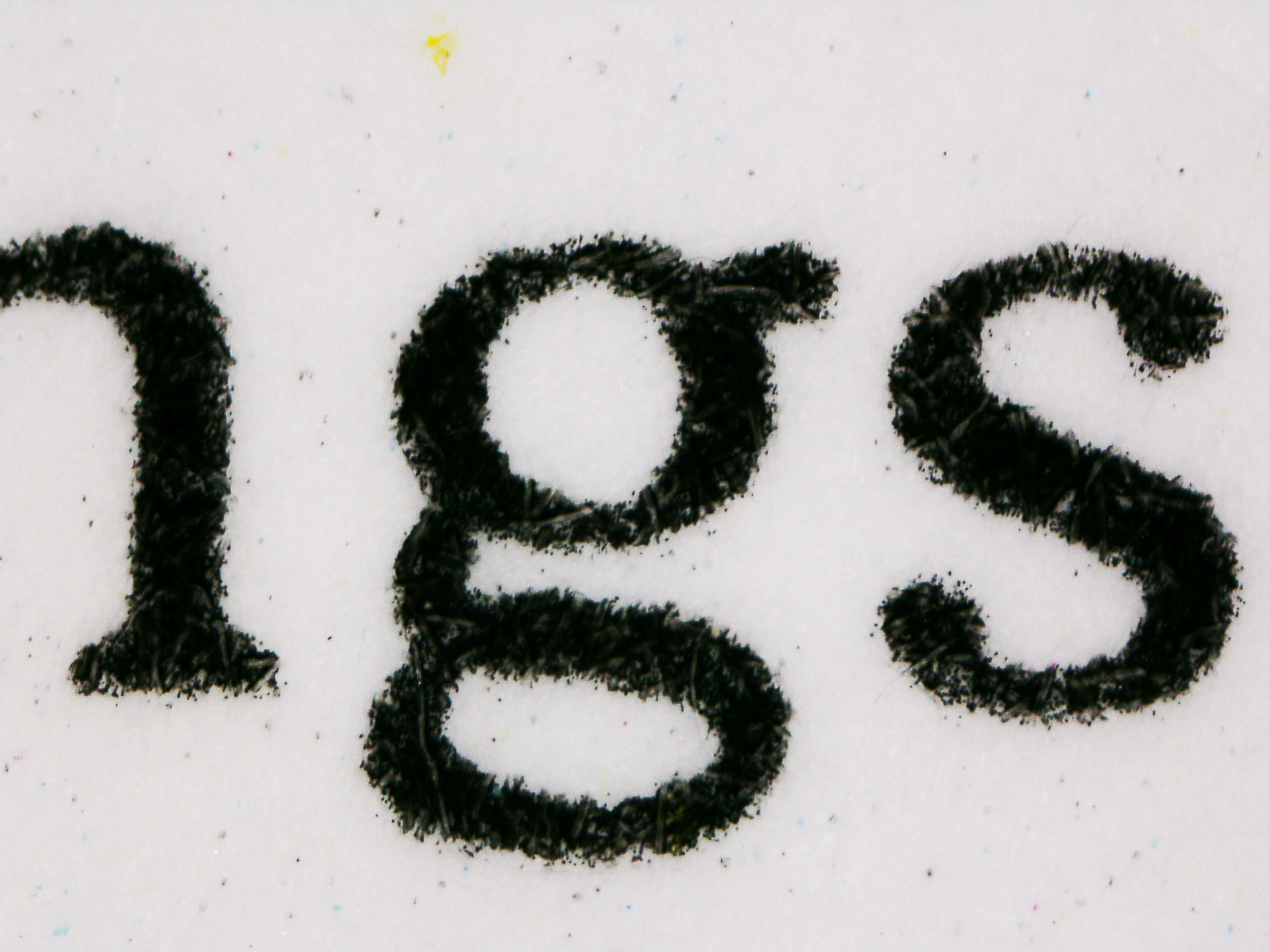
I also designed a type specimen that shows the font's main features and it's appearance printed in small sizes.